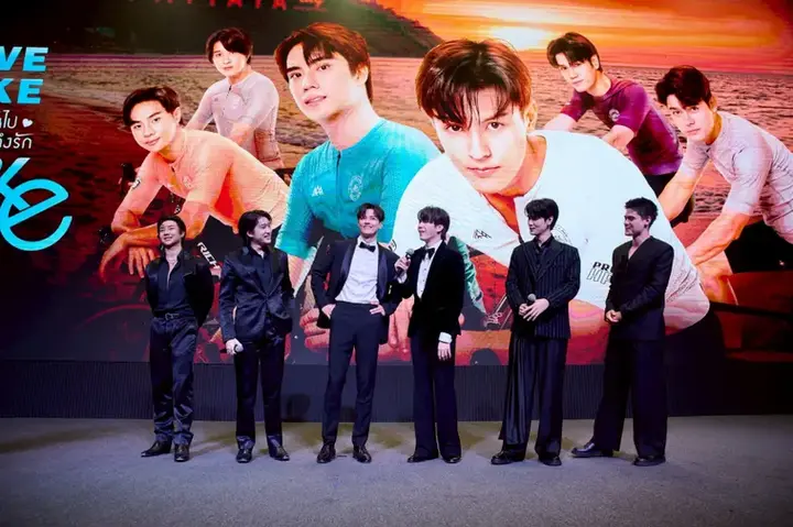
LOVE LIKE A BIKE SERIES
On Netflix & Channel 3
Character Campaign & Key Visual Development
Client: S-Class Entertainment
Director: Tanwarin Sukkhapisit
Platform: Channel 3 / Netflix
Role: Creative Visual Development,
Campaign Photography, Poster Design
Love Like A Bike was a visual campaign project developed to introduce the series through
a distinctive and memorable character identity.
The objective was to create promotional visuals that could communicate each character's personality while maintaining a unified campaign direction across digital, social and outdoor placements.

SCOPE OF WORK
01 Creative Direction
02 Mood & Visual Planning
03 Campaign Visual Development
04 Brand & Logo Design
05 Production Photography
06 Key Visual & Poster Design
CHALLENGE
To transform a standard fitting session into a high-efficiency creative production day.
Beyond introducing multiple characters and establishing a memorable visual identity, the challenge was to concept, plan and produce several campaign visual sets within just eight hours, ensuring every lighting setup, wardrobe change and composition delivered maximum creative and commercial value.


01 Creative Direction
The project began with a series of creative workshops and briefing sessions with the director to fully understand the series narrative, character dynamics and emotional themes.
These insights formed the foundation for the campaign’s visual language, ensuring every image reflected the story and personality
of each character.
03 Campaign Visual Development
To maximise production efficiency, the entire campaign was structured into three shooting s
ets across an eight-hour production schedule, divided between morning and afternoon sessions.
Detailed production breakdowns, talent scheduling and time management plans were developed to ensure every concept could be executed within
the limited shooting window while maintaining
visual consistency across posters, social content
and PR materials.
02 Mood & Visual Planning
Based on the script and character backgrounds, we developed visual concepts, storyboards
and mood boards to align the creative vision across all stakeholders.
The planning process was divided
into two key phases
2.1 Production Photography Planning
Developing concepts, shot lists, visual references and storytelling directions for campaign photography.
Two initial visual concepts were proposed
-
Morning Concept: Fitting sessions featuring all characters, introducing their personalities and relationships.
-
Afternoon Concept: Conceptual portraits of the main cast using bicycles, couples and group compositions, developed through toolkit-inspired and top-angle visual approaches.
2.2 Logo & Visual Identity Exploration
Presenting and refining logo concepts that could communicate the spirit of the series while supporting future marketing materials.
04 Brand & Logo Design


05 Production Photography
Morning | Character Fitting
The morning session focused on fitting photography, introducing the characters, their personalities and relationships through clean, straightforward compositions.
To achieve a natural and authentic look,
we designed a five-light setup with
a front-facing camera position, minimising dramatic shadows and creating a consistent visual foundation for the campaign.
The cast changed into two key wardrobe sets throughout the session their everyday private looks and cycling outfits.
By grouping these looks into a single lighting setup, we significantly reduced reset times and ensured maximum shooting efficiency.
6 Main Characters | 2 wardrobes


Afternoon | Campaign Visual Concepts
The afternoon session shifted towards more conceptual imagery, inspired directly by the creative direction and campaign narrative. The focus moved to cinematic couple portraits, group compositions and top-angle photography, using more stylised lighting and dynamic camera placements to create memorable key visuals.
The entire production schedule was strategically divided between morning and afternoon setups to minimise lighting changes and maximise shooting time.
This approach enabled the team to complete all three shooting sets approximately one and a half hours ahead of schedule while maintaining a strong and cohesive visual identity throughout the campaign.

Top Angle | Group | Individual | Couple


06 Key Visual & Poster Design
Official Teaser Poster
![LLAB-Poster-1--[Recovered]_edited.jpg](https://static.wixstatic.com/media/89e242_257b480ce95d4274aa1b132b4924d0ad~mv2.jpg/v1/fill/w_635,h_884,al_c,q_85,usm_0.66_1.00_0.01,enc_avif,quality_auto/LLAB-Poster-1--%5BRecovered%5D_edited.jpg)
KV concept 1 Banner


KV Instagram feed | Introduction Chracters


Banner concept 2


KV concept 2 Banner


OUTCOME
Developed promotional visuals, poster campaigns, and visual identity materials used to shape the first audience perception of the series.
USED FOR
-
Promotional Campaigns
-
Poster Key Visuals
-
Streaming Platform Marketing
-
Entertainment Press Materials
-
Social Media Promotion
VISUAL LANGUAGE
Soft cinematic lighting, emotional framing, and fashion-inspired composition were used to create a polished romantic atmosphere.
Visual references drew from Korean drama campaigns, streaming-platform key visuals, and editorial portraiture.
KEYWORDS
Creative Direction
Campaign Visual Development
Character Visual Direction
Entertainment Campaign
Poster Key Visual Design
Narrative-driven Visual
Cinematic Storytelling